
Attractive, Effective & Descriptive Image Visualization in Python
Add scalebars, visualize image distribution, correct outliers, and more.

This post introduces some of the functionalities in seaborn-image for descriptive, effective and attractive image visualization.
Seaborn-image is an open source python visualization library for images built on top of matplotlib. It aims to provide a high level API to visualize image data similar to how seaborn provides high level API to visualize tabular data. As the name suggests, seaborn-image is heavily inspired by the seaborn library.
Installation
Let's begin by installing seaborn-image
python -m pip install --upgrade seaborn-image
and then importing seaborn-image as isns
import seaborn_image as isns

# set context
isns.set_context("notebook")

# set global image settings
isns.set_image(cmap="deep", origin="lower")

# load sample dataset
polymer = isns.load_image("polymer")
All the functions in seaborn-image are available in a flat namespace.
isns.set_context() helps us globally change the display contexts (similar to seaborn.set_context()).
In addition to the context, we also globally set properties for drawing our image using isns.set_image(). Later, we will also look at globally setting image scalebar properties using isns.set_scalebar().
Under the hood, these functions use matplotlib rcParams for customizing displays. You can refer to the docs for more details on settings in seaborn-image.
Lastly, we load a sample polymer dataset from seaborn-image.
2-D Images
Visualizing the image is as simple as calling the imgplot() function with the image data. imgplot() uses matplotlib imshow under the hood but provides easy access to a lot of customizations. We will take a look at a few of the customizations in this blog post.
By default, it adds a colorbar and turns off axis ticks. However, that is only beginning to scratch the surface!
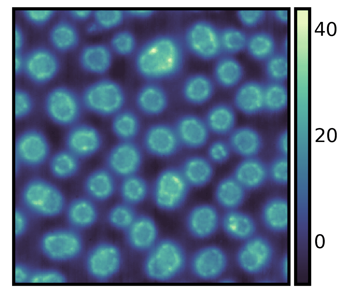
We can get some basic descriptive statistics about our image data by setting describe=True.
ax = isns.imgplot(
    polymer,
    describe=True,  # default is False
)
No. of Obs. : 65536
Min. Value : -8.2457214
Max. Value : 43.714034999999996
Mean : 7.456410761947062
Variance : 92.02680396572863
Skewness : 0.47745180538933696
You can also use
imshow, an alias forimgplot
Draw a Scalebar
Although we know some basic information about our image data, we still do not have any information about the physical size of the features in the image. We can draw a scalebar to rectify it.
To add a scalebar to the image we can specify the individul pixel size dx and physical units. Here, the individual pixel is 15 nanometers in physical size. So, we set dx=15 and units="nm".
ax = isns.imgplot(
    polymer,
    dx=15,  # physical size of the pixel
    units="nm",  # units
    cbar_label="Height (nm)"  # colorbar label to our image
)
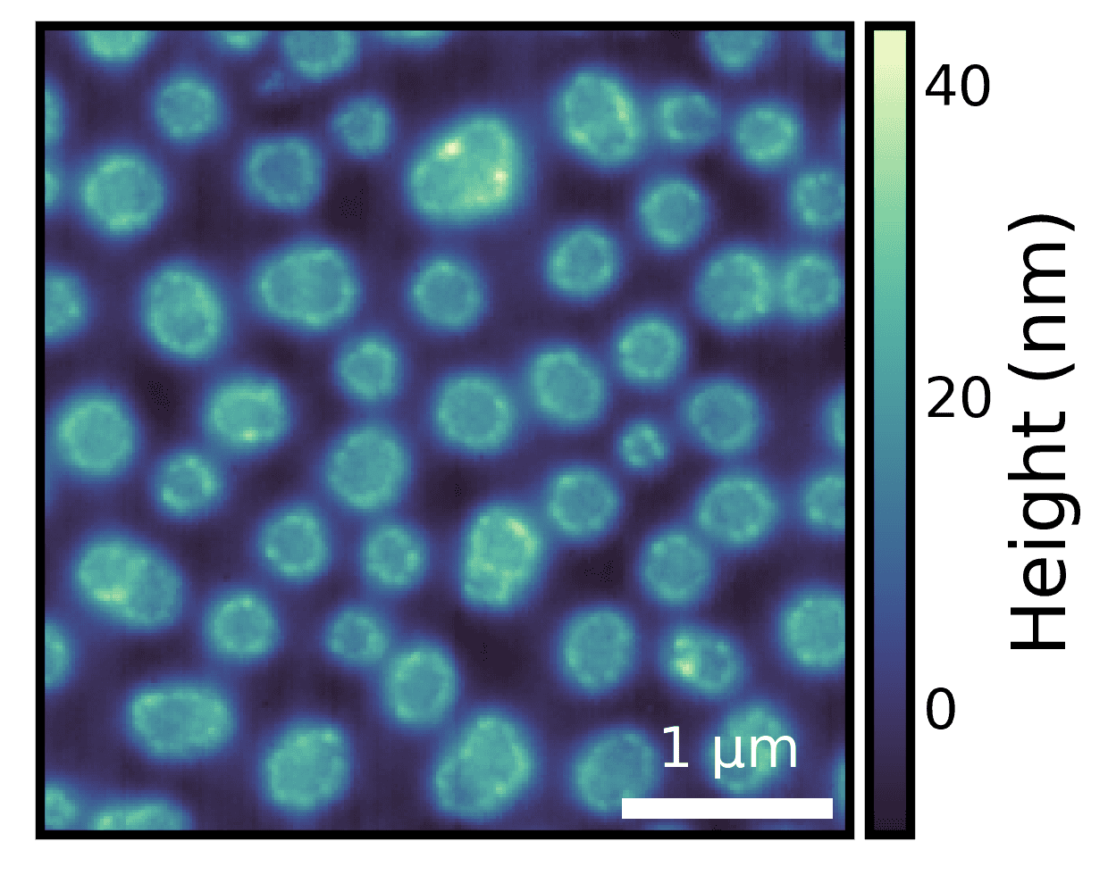
Note: We only specified the individual pixel size and units, and a scalebar of appropriate size was drawn.
Tip: You can change the scalebar properties such as scalebar location, label location, color, etc. globally using
isns.set_scalebar()
Correct for Outliers
Real data is never perfect. It is often riddled with outliers and these outliers affect the image display.
# sample data with outliers
pol_outliers = isns.load_image("polymer outliers")

ax = isns.imgplot(pol_outliers, cbar_label="Height (nm)")
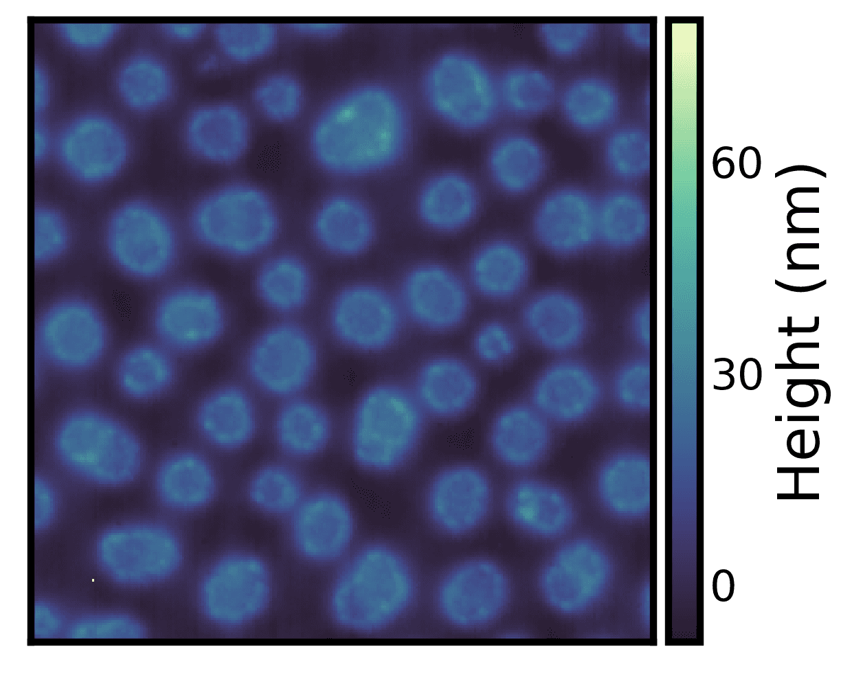
The above example dataset has a single outlier pixel which is affecting the image display. We can correct for the outliers using the robust parameter in all seaborn-image functions.
ax = isns.imgplot(
    pol_outliers,
    robust=True,  # set robust plotting
    perc=(0.5, 99.5),  # set the percentile of the data to view
    cbar_label="Height (nm)"
)
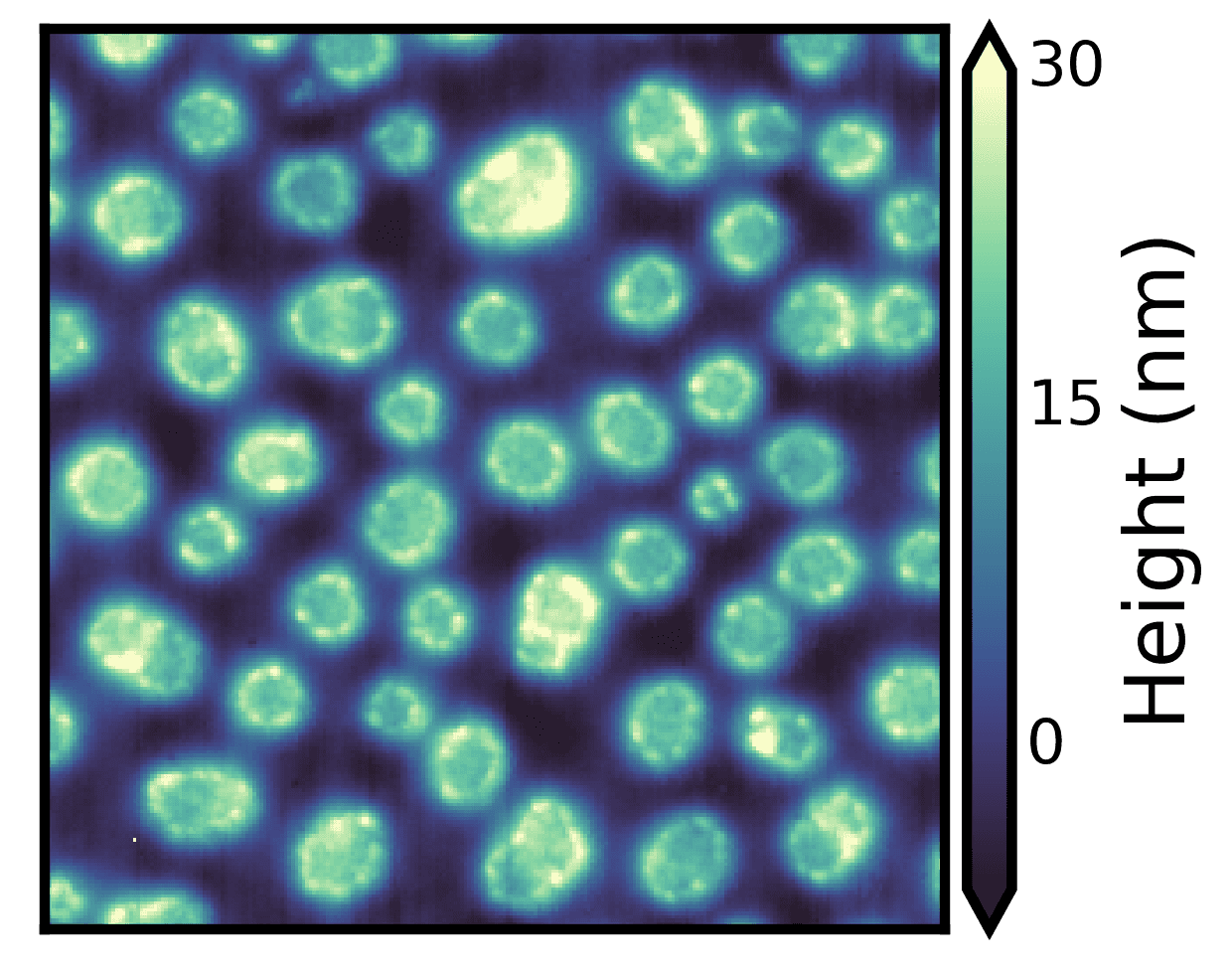
Here, we are setting robust=True and plotting 0.5 to 99.5 percentile of the data (specified using the perc parameter). Doing so appropriately scales the colormap based on the robust percentile specified and also draws colorbar extensions without any additional code.
Note: You can specify the
vminandvmaxparameter to override therobustparameter. Seeimgplotdocumentation examples for more details
Image Data Distribution
One of the most important things in image visualization is knowing the distribution of the underlying image data. Here, we are using imghist() to plot a histogram along with the image.
fig = isns.imghist(polymer, dx=15, units="nm", cbar_label="Height (nm)")
Note that there are no new parameters required.
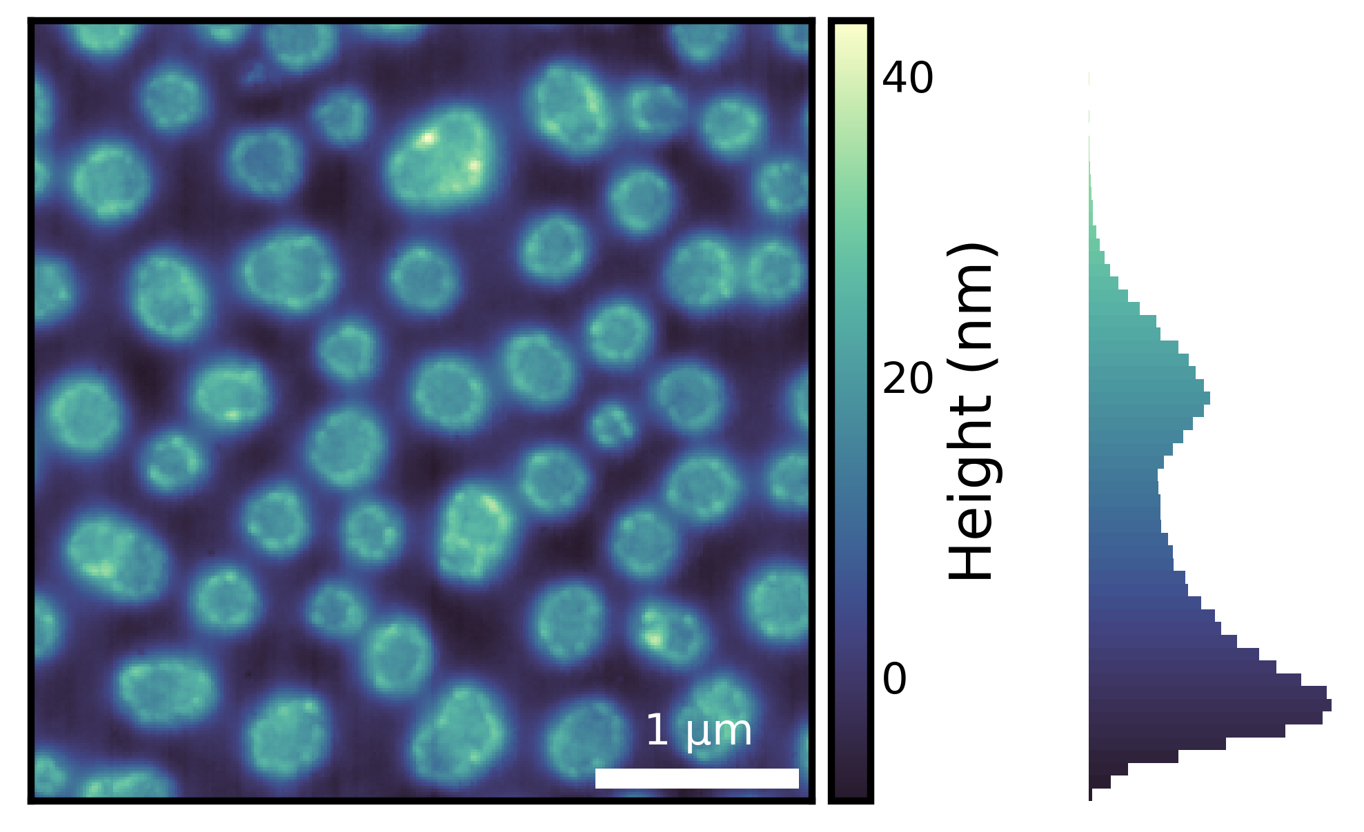
Using histogram along with an appropriate colormap provides additional information about the image data. For instance, from the histogram above, we can see that majority of the data has values less than 30 nm and there are very few values that are close to 40 nm - something that may not be obvious if we look at the image without the histogram.
Tip: You can change the number of bins using the
binsparameter and the orientation of the colorbar and histogram using theorientationparameter. Seeimghistdocumentation examples for more details
Importantly, generating the entire figure - with a histogram matching the colorbar levels, scalebar describing the physical size of the features in the image, colorbar label, hiding axis ticks, etc. - took only one line of code. In essence, this is what seaborn-image aims to provide - a high level API for attractive, descriptive and effective image visualization.
Lastly, this post has only introduced some of the high level API that seaborn-image provides for image visualization. For more details, you can check out the detailed documentation and tutorials and the project on GitHub.
Thanks for reading!